


Most UX portfolios don’t get passed over because the work is bad. They get passed over because nobody reviewing them could tell what the designer actually did, or why. If you want to learn how to build a UX portfolio that leads to interviews, that’s the problem to solve first.
It’s a frustrating spot to be in. You can have a sharp eye, strong research skills, and a few projects you’re genuinely proud of, and still hear nothing back. Your portfolio is usually the first real look a hiring manager gets at how you work. A resume can say you know user research. A portfolio has to prove it.
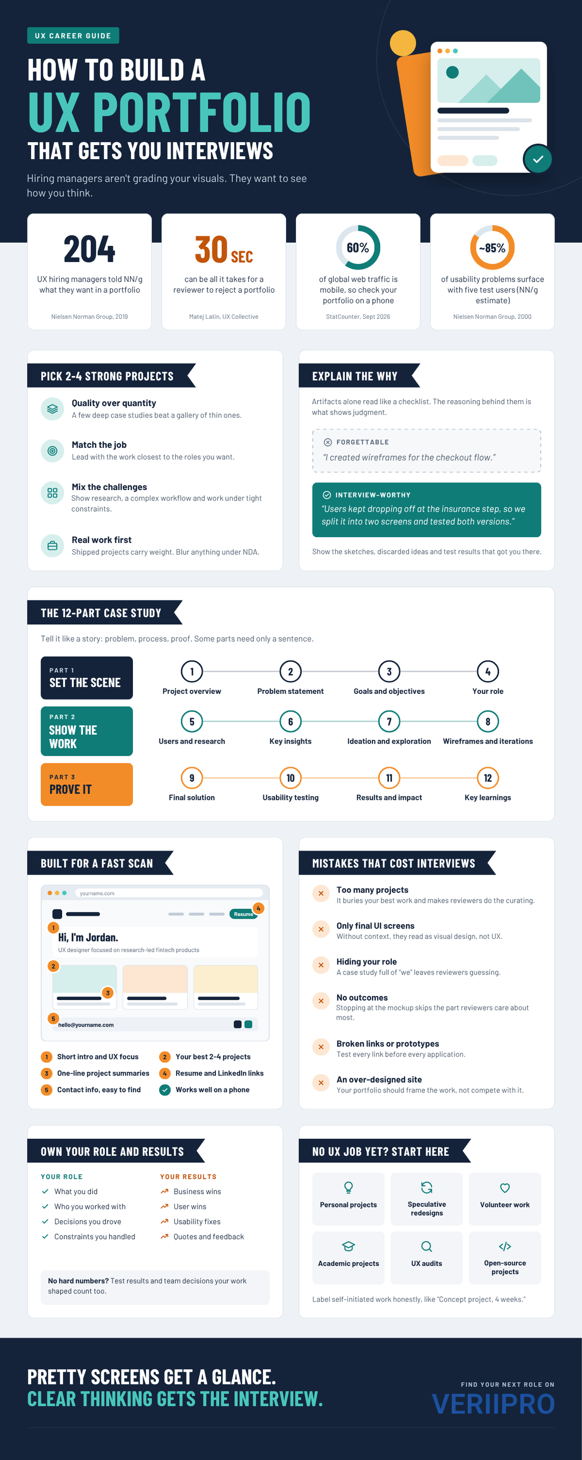
That’s why the best portfolios focus on thinking over decoration. When Nielsen Norman Group surveyed 204 UX professionals who hire designers, the message was consistent: show the problem, the process, the messy middle, and what changed because of your work. Polished screens help. They just aren’t the whole story.
The payoff for getting this right is significant. According to the U.S. Bureau of Labor Statistics, web and digital interface designers earned a median salary of $104,000 in May 2025, and the broader field is projected to grow 5% between 2025 and 2035. There are good UX designer jobs out there. Competition for them is tough, though, and your portfolio is where you win or lose the first round.
So what does a portfolio like that look like?
What Makes a UX Portfolio Stand Out?
The portfolios that get callbacks have a few things in common, and almost none of them involve fancy scroll animations.
They show clear UX design thinking. A reader can follow the thread from “here’s what was broken” to “here’s what we learned about users” to “here’s why the design ended up this way.” They also show how you solve problems, rather than parading a stack of deliverables. A persona on its own proves you can make a persona. What a hiring manager wants to know is what that persona changed.
Strong portfolios feature relevant projects, too. If you’re applying for a fintech role, a banking app redesign will land harder than a recipe app, even if the recipe app is prettier. And the case studies are well structured, so a busy reviewer can skim and still get the story.
Two more things separate a memorable UX design portfolio from a forgettable one. First, your specific role is obvious. Nobody should have to guess whether you led the research or just polished the final mockups. Second, there’s evidence of outcomes and impact. That might be a metric, a quote from a usability session, or a product decision your work influenced. Anything that shows the project actually mattered.
All of that starts with the projects you pick.
Choose the Right UX Projects for Your Portfolio
When people first build a UX portfolio, the instinct is to include everything. You want to show range, so in goes every class project, every side gig, and that logo you made for a friend’s bakery.
Resist it. Pick two to four strong projects and go deep on each one. That same NN/g research found hiring managers consistently value quality over quantity, and its guidance tops out at around five detailed case studies. A reviewer who reads one excellent case study will learn more about you than one who clicks through eight thin ones.
As you narrow the list, prioritize projects that line up with the jobs you want. Then look for variety in the kinds of UX challenges you tackled. Maybe one project is research-heavy, another simplifies a complicated workflow, and a third shows you working within tight technical constraints. That mix tells a hiring manager you can handle more than one type of problem.
Use real projects whenever you can. Work you shipped with a team, under actual deadlines and stakeholder pressure, carries weight a solo concept can’t fully match. If your best work is under an NDA, you can still walk through the process, recreate or blur sensitive screens, and focus on decisions instead of proprietary details. When in doubt, ask your former employer what’s okay to share.
No professional experience yet? That’s fine. Personal, academic, freelance, and redesign projects all count, as long as you approach them with the same rigor and present them honestly. There’s a full section on that below.
How to Structure a UX Case Study
If you’re wondering how to write a UX case study people will actually read, think of it as a story with a beginning, a middle, and an ending that matters. It shouldn’t feel like a scrapbook.
Here’s a reliable UX portfolio structure to follow for each case study:
- Project overview: What the product is, who it’s for, and the timeline.
- Problem statement: What was broken, confusing, or missing. Be specific.
- Goals and objectives: What success looked like for users and for the business.
- Your role: Your title, responsibilities, and who you worked with.
- Users and research: Who you talked to, how, and why you chose those methods.
- Key insights: The two or three findings that shaped the design.
- Ideation and exploration: Early sketches, competing concepts, and ideas you dropped.
- Wireframes and iterations: How the design evolved and what drove each change.
- Final solution: The finished design, annotated to explain key decisions.
- Usability testing: What you tested, what broke, and what you fixed.
- Results and impact: What changed for users or the business.
- Key learnings: What you’d do differently next time.
Twelve sections might sound like a lot, but they don’t all need equal space. Some can be a single sentence. The goal is simple: the reader should never wonder what happened between “the problem” and “the solution.” Look through strong UX portfolio examples online and you’ll notice most follow some version of this arc, even when the visual styles look nothing alike.
One more tip. Add a three-line summary at the very top covering the problem, your role, and the outcome. Some reviewers will read that and nothing else before deciding whether to keep going.
Show Your UX Design Process
Your process is where a hiring manager figures out whether you can be trusted with a messy, ambiguous problem. Depending on the project, it might include:
- User research, like interviews, surveys, or analytics reviews
- Personas and user journeys
- Information architecture
- User flows
- Wireframing
- Prototyping
- Usability testing
- Iteration based on what you learned
Here’s the catch, though. Including these artifacts isn’t enough. Plenty of portfolios lay out a persona, a journey map, and a set of wireframes in a neat row with zero explanation of how one led to the next. That reads like a checklist, and experienced reviewers spot it right away.
What signals UX judgment is explaining why you made important design decisions and what evidence pushed you in that direction. Compare these two lines. “I created wireframes for the checkout flow.” Versus: “Users in our interviews kept dropping off at the insurance step, so we split it into two screens and tested both versions.” The second one tells a hiring manager far more than a beautiful wireframe ever could.
Don’t hide the messy parts, either. NN/g points out that final screenshots only tell part of the story, and the hiring managers it surveyed specifically wanted to see early sketches, whiteboards, and research documentation. Ideas that didn’t make it are worth including. They show you explored options before committing to one.
And if you only tested with a handful of people, say so without apologizing. Nielsen Norman Group’s long-standing research shows that testing with just five users uncovers about 85% of usability problems. A small round of testing is a legitimate method.
Explain Your Role and Contributions
UX is a team sport, which creates a tricky problem for portfolios. If your case study says “we” from start to finish, the reader can’t tell whether you drove the project or sat in on the meetings.
Be direct. For each project, make it clear:
- What you personally worked on
- How the team was structured and who you collaborated with
- What your responsibilities were
- Which decisions you influenced or made
- What you designed versus what came from other team members
- How you handled constraints or stakeholder feedback
That last point gets overlooked all the time. Hiring managers know projects come with tight budgets, legacy code, and executives with strong opinions. A short note like “Engineering couldn’t support real-time sync in the first release, so I designed a manual refresh state that tested well with users” shows maturity. It also shows you can work with people, which is a big part of the job.
Writing “I” can feel awkward if you’re used to crediting the team. You can do both. Name your collaborators clearly, then own your part without hedging.
Focus on Outcomes, Not Just Screens
A gallery of gorgeous screens answers one question: can you make things look good? A hiring manager is asking a different one. Did it work?
Show what changed because of your work. Outcomes come in a few forms:
- Business outcomes: revenue, retention, fewer support tickets, or time saved for internal teams
- User outcomes: fewer errors, faster task completion, or higher satisfaction
- Usability improvements: issues found and fixed between testing rounds
- Conversion or engagement gains: when you have access to the data
- Qualitative feedback: direct quotes from users or stakeholders
- Downstream changes: a decision, process, or roadmap that shifted because of your work
Not every project comes with hard numbers, and that’s okay. Many designers never see post-launch analytics, and student projects rarely ship. Observable outcomes still count. “In the second round of testing, all five participants finished checkout without help, compared to two out of five in round one” is a legitimate result. So is “the product team adopted my navigation model for the next two releases.”
Just don’t end a case study at the final mockup. That’s like a movie that cuts to black right before the ending.
Design a Portfolio That Recruiters Can Scan Quickly
Nobody reads a portfolio top to bottom on the first pass. Designer and author Matej Latin, drawing on his time screening a couple hundred applications a week at a big tech company, estimates that reviewers often need only 30 seconds to reject a portfolio.
Whether it’s 30 seconds or three minutes, the lesson holds. The project, your role, the problem, and the value you added need to be visible early, without anyone having to dig.
A few UX portfolio tips that make scanning easier:
- A clear homepage that tells people who you are and what you do at a glance
- Strong project thumbnails that hint at the problem, not just the UI
- Short project summaries under each thumbnail
- Easy navigation between case studies and back to the homepage
- Clear typography and hierarchy, with descriptive headings and short paragraphs
- A mobile-friendly design, since mobile devices now account for roughly 60% of web traffic worldwide and there’s a good chance a recruiter opens your link on a phone between meetings
- Important information near the top, so nobody has to scroll forever to find your role or results
Keep in mind that your portfolio is a UX project in its own right. If it’s hard to navigate, a hiring manager will fairly wonder what the rest of your work is like.
What to Include on Your UX Portfolio Homepage
When people ask what to include in a UX portfolio, the homepage is the right place to start. It sets the tone for everything else and often decides whether anyone clicks further.
Cover these basics:
- A short professional introduction: two or three sentences that sound like an actual person wrote them
- Your UX specialization: research, interaction design, product design, accessibility, or whatever you want to be known for
- Key skills: a handful, not a wall of software logos
- Selected projects: your strongest case studies, front and center
- Brief project descriptions: one line each on the problem and your role
- A resume link: easy to find and easy to download
- Contact information: at minimum, a professional email address
- LinkedIn and other professional profiles: so recruiters can check your background quickly
Beyond the homepage, keep the site lean. The UX Design Institute suggests a simple setup built around a home page, an About page, your case studies, and a contact page. That’s plenty. Skip the extra pages unless they directly support the roles you’re targeting.
UX Portfolio Mistakes That Can Cost You Interviews
Some mistakes are easy to spot in someone else’s portfolio and surprisingly hard to see in your own. Watch for these:
- Too many projects. It buries your best work and forces reviewers to do the curating.
- Only final UI screens. Without context, they read as visual design, not UX.
- Generic case studies. If yours could describe almost any project, rewrite it.
- Hiding your role. A case study full of “we” leaves reviewers guessing.
- No explanation of design decisions. Artifacts without reasoning don’t show judgment.
- No measurable or observable outcomes. Ending at the mockup skips the part hiring managers care about most.
- Too much text. Detail is good. Long, unbroken paragraphs are not.
- Poor navigation. Oddly common in a field built around usability.
- Broken links or prototypes. Test every link before every application. Every single time.
- Outdated projects. If your newest work is three years old, expect questions.
- An over-designed portfolio. Heavy animation and experimental layouts can pull attention away from the work.
That last one trips up a lot of talented designers. Your portfolio should frame your work, not compete with it.
How to Build a UX Portfolio With No Experience
Everyone starts somewhere, and hiring managers know it. Career changers and new grads land their first UX roles all the time with portfolios built entirely outside of paid work. The key is choosing projects that let you show your process from start to finish.
Good options include:
- Personal UX projects: Find a problem you or people around you deal with, and design a solution. Do actual research, even if it’s five interviews with friends of friends.
- Speculative redesigns: Pick an existing app or website and rethink one specific flow. Focus on a clear user problem, not a visual facelift.
- Volunteer projects: Nonprofits, local businesses, and community groups often need help, and they’ll give you real stakeholders and constraints.
- Academic projects: Course and bootcamp work counts, especially if you push it beyond the original assignment.
- UX audits: Evaluate an existing product against established usability heuristics and document what you’d fix and why.
- Open-source or community projects: Many open-source tools need design help, and contributing shows you can work alongside developers.
Whatever you include, be upfront about what it was. Label a redesign as a self-initiated concept, and don’t imply a company hired you if it didn’t. Most hiring managers respect self-driven work, but they lose trust fast if a “client project” turns out to be a class assignment. A simple line at the top, like “Self-initiated concept, four weeks,” solves the problem.
How to Tailor Your UX Portfolio to a Job
Sending the same portfolio to every opening is easy. It’s also less effective than most people think.
UX hiring expert Jared Spool describes portfolio reviews as a hunt for direct evidence of comparable experience. Your job is to make that evidence easy to find.
Start by matching your projects to the job description. If the role emphasizes research, lead with your most research-heavy case study. If it’s a complex B2B product, put your workflow project first. Highlight the UX skills the posting calls out, prioritize the case studies that fit, and use the employer’s terminology where it makes sense. If they say “journey mapping,” don’t call it “experience mapping.”
You’ll also want to adjust based on the type of role:
- UX Designer: Balance research, flows, and interaction design.
- Product Designer: Emphasize business impact, cross-functional collaboration, and end-to-end ownership.
- UX Researcher: Lead with methods, synthesis, and how your findings shaped decisions. Visuals can take a back seat.
- UI/UX Designer: Show strong visual craft alongside the reasoning behind it.
Tailoring doesn’t mean rebuilding your site for every application. Reordering projects, swapping the featured case study, or tweaking your intro is usually enough. If you’re actively applying, scanning current UX designer jobs on VeriiPro can also show you which skills keep appearing in postings, so you know what to put front and center.
UX Portfolio Tools and Platforms
You don’t need to code to build a UX portfolio that looks professional. These are the most common options:
- Portfolio website: The standard choice. A custom site gives you full control over structure and presentation.
- Figma: Ideal for designing case study layouts, and Figma Sites now lets you publish designs straight to the web.
- Webflow: Powerful and flexible, with plenty of design portfolio templates to start from, though it comes with a learning curve.
- Framer: A website builder that’s popular with designers for its smooth interactions and quick publishing.
- Notion: Fast and simple. Works well for an early portfolio or a quick case study draft, but it’s hard to make it feel distinctive.
- Behance: Good for visibility in the design community, though its format favors visuals over long-form case studies.
- Adobe Portfolio: Easy to set up and included with most Creative Cloud plans, so it’s worth a look if you already pay for Adobe.
So should you use a personal domain or stick with a platform? If you’re actively job hunting, get the domain. Something like yourname.com is inexpensive, easy to remember, and looks more established than a platform subdomain. Platforms like Behance work best as a supplement that points people back to your main portfolio. Early on, or when you just need something live this week, a platform URL is perfectly fine. Upgrade when you can.
Final UX Portfolio Checklist
Before you hit send on your next application, run through this list:
- Two to four strong case studies
- A clear problem and goal for each project
- Your role is obvious
- Research and reasoning are included
- Design decisions are explained
- Iterations are shown
- Outcomes are highlighted
- The portfolio is easy to navigate
- Your resume and contact details are easy to access
- All links and prototypes work
- Everything looks and works well on mobile
If you can check every box, you’re ahead of a lot of applicants. Then ask someone outside your bubble, ideally a working designer, to spend five minutes with it and tell you what they remember. Their answer will tell you what’s actually landing.
Final Takeaway
Pretty screens get a glance. Clear thinking gets the interview.
A strong UX portfolio should prove you can identify problems, understand users, make informed design decisions, work through constraints, and create outcomes someone can see or measure. Attractive interfaces are part of that. They’re just the last chapter.
So when you build your UX portfolio, pick fewer projects and go deeper on each one. Make your role and your reasoning impossible to miss. Do that, and you give recruiters every reason to reach out.